Sun rises on ANU students' redesign of mental health centre

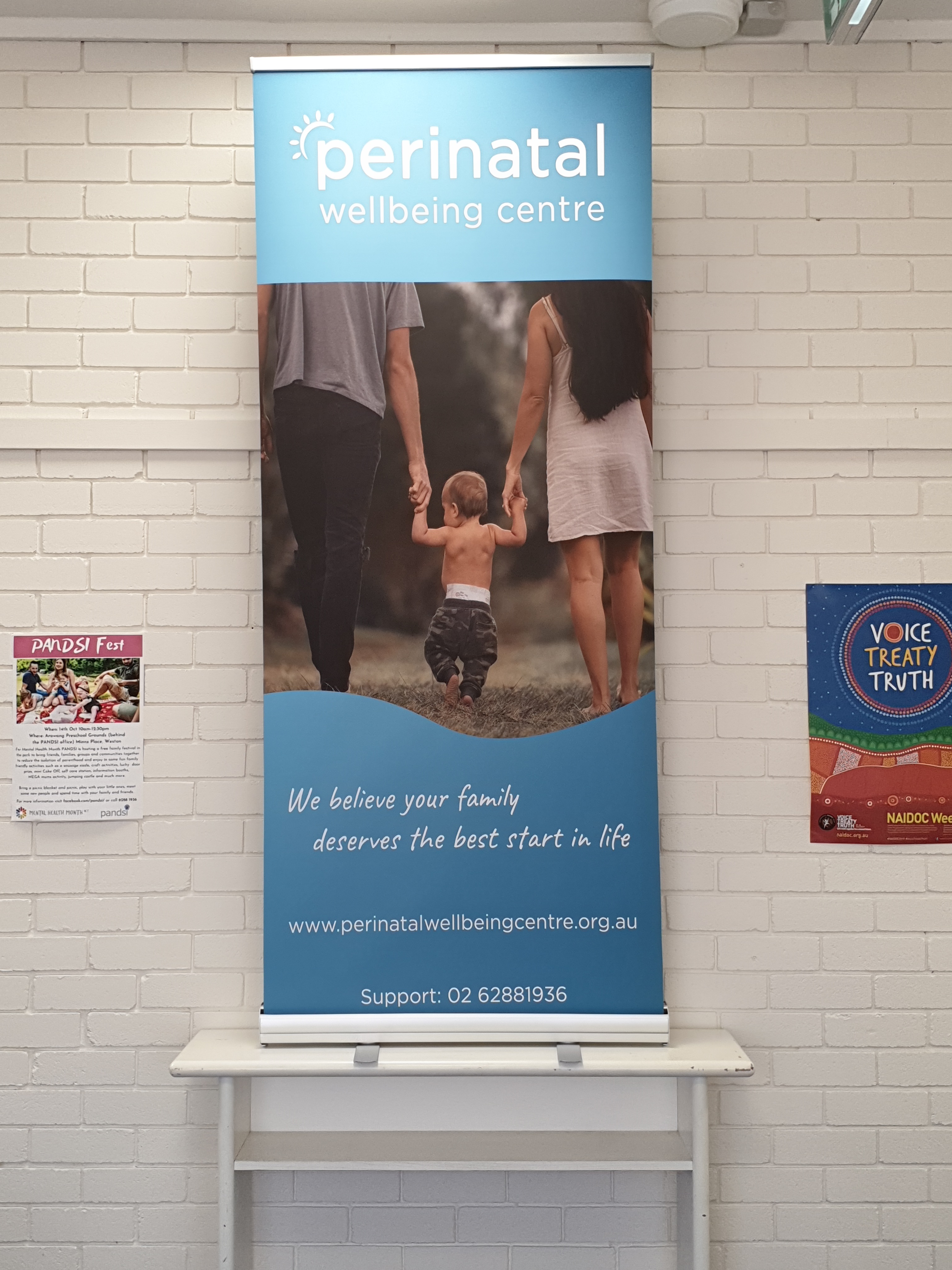
Reaching a milestone like turning 30 can be the catalyst for change and a refresh. At least it was for the organisation formerly known as PANDSI (the Post and Ante Natal Depression Support and Information Inc). PANDSI recently turned over a new leaf and was reborn as the Perinatal Wellbeing Centre.
“Turning 30 in 2019, at the same time as we were being assessed for reaccreditation as a mental health service, provided a great opportunity to consider the role we were playing in our community, and how we were perceived,” says Dr Yvonne Luxford, Chief Executive Officer of the centre.
PANDSI decided they needed to overhaul their look, adopt a new name, and make it clearer that their services are more inclusive than they may have previously appeared.
“We had been focused on increasing the professionalism of our services, had seen significant increase in demand for our telephone counselling and group support programs, and were developing mechanisms to expand our services to better meet the needs of our culturally diverse society,” says Dr Luxford.
“Conversations with a variety of stakeholders indicated that the name PANDSI didn't resonate with them as it once had, and it was actually a deterrent for some potential male clients.”
Along came Andre Correa Diniz Barbeto and Ben Foster, two students who took on the redesign as their final project for an ANU Design course.
“We had real clients come in and present to us different kinds of design projects,” says Ben, who is studying a Bachelor of Design. “PANDSI wanted to completely re-brand themselves and redefine how they appear to everybody.”
“We were able to help them re-brand and make it a bit more relevant for men and women,” explains Andre, who has now completed a Master of Design (Advanced).
Ben found that he really connected with PANDSI’s values after he learned more about the organisation.
“I didn’t know what post and ante natal depression was or realised how widespread it was and how it affected men as well,” he says. “I thought it was really important to help them out where I could.”
The Drawing Board
Dr Luxford initially met with Ben, Andre, and the rest of their project team to tell them what she was seeking. Later, the group presented their proposal to her, some of her staff members, as well as someone who had used the centre's services.
“They were able to give us input on what they see and feel PANDSI is all about,” Andre says.
Ben adds: “It combined both sides of the story – the people who run the organisation and the people who use the organisation.”
“Like typical non-experts, we brought a motley collection of poorly expressed design ideas to meetings which they generously took on board and returned with innovative concepts for us to consider,” Dr Luxford says.
Andre: “There were no real guidelines until we gave her options and [Dr Luxford] realised what she liked and didn't like.”
Naming Rights
Ben and Andre’s team brainstormed possible new names for PANDSI. They came up with words that the name could build upon, and liked ‘bloom’ in particular to reference the sun blooming and shining. But, Ben says, many of the names they suggested were already taken by other companies.
“We did agree on some words like ‘centre’ and ‘care’,” Andre says. “At the end of the day, Yvonne had to go back to PANDSI’s Board to make sure the name was alright both to register as well as being okay with everyone in the centre.”
Dr Luxford said the final name emerged from their Team Planning Day, adding that as a result, it had strong organisational commitment to it.
Ben says: “They came back to us with their name. Then we tried to adapt our designs to the name they suggested.”
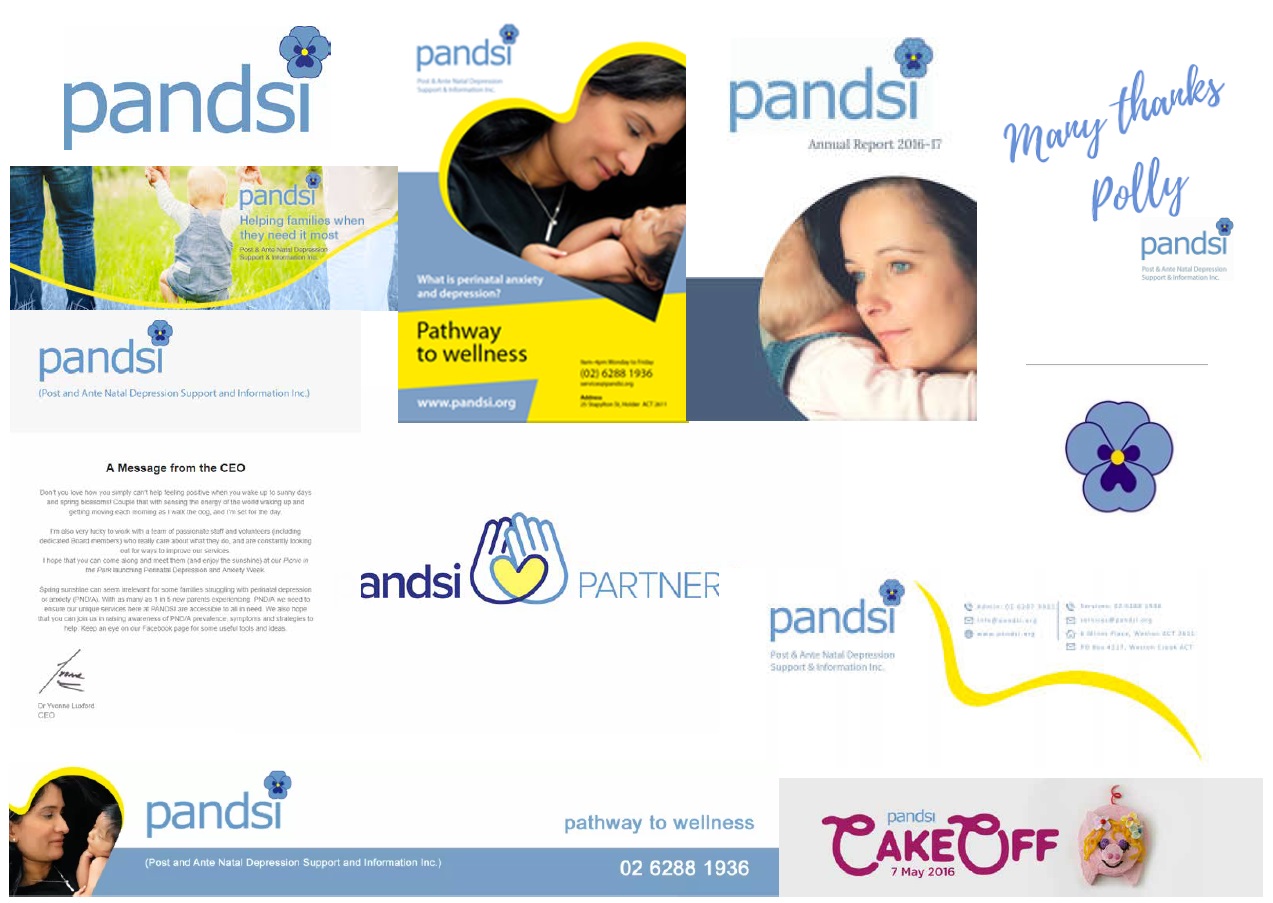
Before and After
Previously, the branding of PANDSI played on the similarity of its name to the flower, pansy. The image of a pansy formed the dot to the ‘I’ in PANDSI. The name and the dominant colour across its branding was a rich sky blue.
Ben described the old fonts and colours as being outdated. “They were quite bland, quite pale; it was something you would glance over as opposed to something that would catch your eye.”
“Currently in design, flat colours and bright single colours are quite powerful. Simplicity is better.”
There was also the matter of the flower in the branding.
“The font was all lower case, a soft delicate thing. It had little swirls to it and didn't look very masculine. Plus the flower – we had to stray away from that completely,” Ben says.
Andre chimed in: “Things are changing a lot and there is not so much masculine and feminine nowadays anymore, but at the same time there is still this boundary where some colours and some shapes tend towards more masculine and feminine sides.”
The final outcome was something a bit more medical in aesthetic. An aqua to deep blue gradient; though they also provided an orange option. The new logo is clean and modern. There are no flowers anymore – just a sun over the 'p' for Perinatal.
“The key for us was to try to make it equal for everybody and approachable,” Ben says. “We tried to make it very, very gender neutral.”
Andre remembers the sun as being his contribution. “It was like the sun rising and it is all about hope and another day.”
“The woman who was at our presentation who had been through the program was like, 'I really like how the sun reminds me of how the place is bright, happy and joyful.' It really is the face of PANDSI.”
School's out
By the end of the semester, Ben and Andre's team had fulfilled their project's requirements. They had worked on a new name, supplied the Perinatal Wellbeing Centre with a logo the centre was happy with, and provided variations of the logo as well as a design guideline informing how the logo should be used and scaled.
That wasn't the end of the road, however. The centre wanted Ben and Andre to produce more items for them based on the new design. This additional work would be on a paid basis.
Ben says, “There was a brochure, business cards, poster, window signage, door signage... I think there were 14 items in total.”
“It was pretty much everything that they use and how they identify themselves,” adds Andre. “It took about two months for us to complete everything – designing, communications back and forth, changes, flyers, brochures, tax invoices and email banners.”
When asked about the design the pair came up with that her centre adopted, Dr Luxford responds that they love it.
“It is hard to believe that the design was created by a student team – everything about the process was managed professionally and with a focus on excellence,” she says. “We definitely felt that our needs were central to the process, and were excited to be working with students who were obviously accessing the latest concepts and trends through their studies in the School of Art and Design.”
The students found the experience valuable also.
“Not only was it great for our portfolio, but also as work experience,” says Andre. “We got to communicate with them and work directly with the CEO.”
When the new branding was finally unveiled, it was a thrilling time for everyone who had been involved.
“They were really excited by the change and sent us photos of the signs on the building,” Andre says. “Finally they sent out an email to all of their contacts announcing the change – and on top of that email was a big banner that we designed.”
“It was really cool to see it out in the world.”
Image Gallery