ANU Design launches interactive online climate coasters

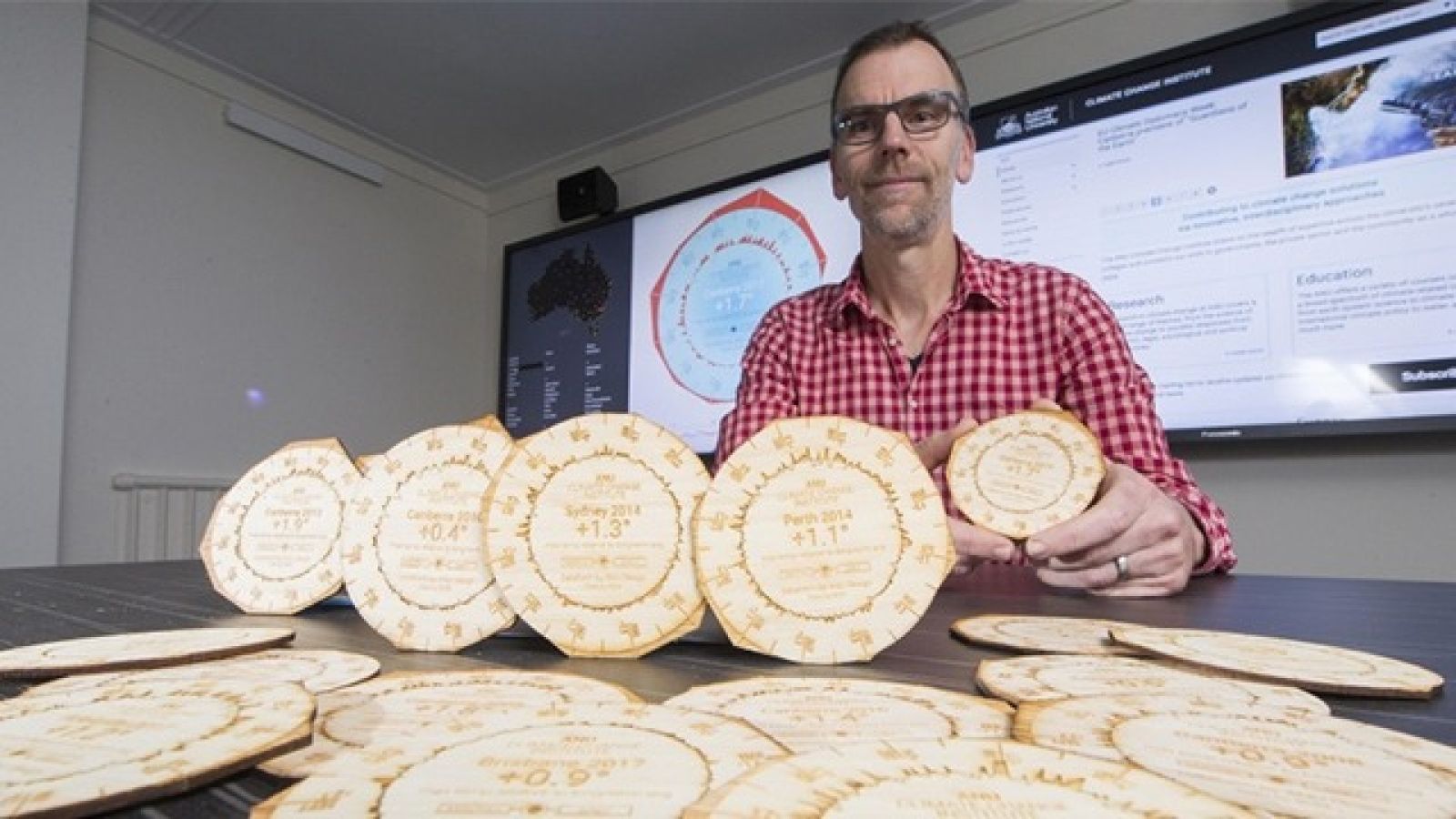
Dr Geoff Hinchcliffe shows off some of the climate coaster. Image: ANU.
A new website that visualises climate change data from 112 locations around Australia started life as a set of drink coasters.
Researchers Dr Mitchell Whitelaw and Dr Geoff Hinchcliffe from the ANU School of Art and Design specialise in creating objects that provide a tangible representation of data.
In late 2017 the pair approached the ANU Climate Change Institute with the idea of collaborating on a small tangible visualisations for the Institute's 2018 State of the Climate event. Sitting on desks, bars or tables, the aim of the coaster was to prompt discussion and reflection on Australia's rapidly changing climate.
The coasters, which visualise 12 months of climate data against long term averages for Australian capital cities, proved so popular that the researchers decided to build a website showing the same visualisation for more than 100 different locations around the country.
"Everyone at the event was captivated," Dr Hinchcliffe said.
"People were handling them, smelling them, asking about them, and everyone wanted more copies.
"So this online version is an opportunity for people to have a look through the visualisations for themselves."
Visitors to the site can download coaster images for print and social media sharing, or for laser cutting their own coasters.
The researchers, who have also made bracelets that represent 12 months of Canberra weather data, believe tangible visualisations of data are a powerful way of helping people understand complex topics.
"They are engaging in a way that traditional graphs just aren't," Dr Whitelaw said.
"Graphs can be static and hard to read, by having these visualisations live and online it lets people have a play around with them.
"I hope in particular that schools can use this website to discuss climate change and build data literacy."
Each coaster shows two rings that represent 12 months of climate data from the Australian Bureau of Meteorology. The inside ring compares daily temperatures to that location's long-term average, the outer ring shows the same visualisation for monthly temperatures.
Of the 112 locations shown on the Climate Coaster website, Charleville in the Queensland Shire of Murweh and Miles in the Western Downs Region had the highest temperatures in 2017 compared to long-term averages - with an increase of 2.6 degrees.
Of the capital cities, Canberra came out top with 2017 temperatures 1.7 degrees above the city's long-term average. Halls Creek in the East Kimberly region of Western Australia was the only location that didn't experience any temperature increase in 2017.
Visit the Climate Coasters website* here: http://gravitron.com.au/climatecoaster
*works best in Google Chrome